 medium projects
MediumGeneral
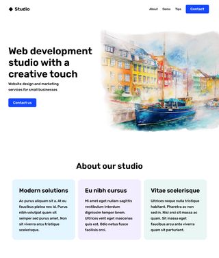
Watercolor Agency Website
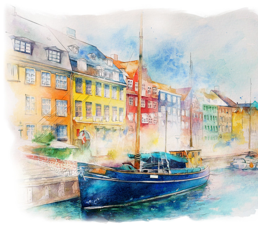
Build a minimalist home page with a hero section including a creative watercolor effect.
Start Now
Downloadable Assets

Paid Help
👤 Client Story:
We are a creative agency focused on captivating world of art and primarily build art-related portfolios. Over time, our agency has grown, and now we're ready to showcase our unique approach to this niche through an updated design. We're excited to see our Figma designer's vision come to life. We need responsive sizing as a given.
Can you build a functional prototype for the home page?
🚀 Summary
This project will help you practice CSS flexbox principles and necessitate understanding of the box-model for padding and margin. Additionally, this medium level project includes common requests related screen-size reponsiveness.
📗 Recommended Pre-study
CSS Box-model
https://css-tricks.com/the-css-box-model
CSS Flexbox practice game
https://flexboxfroggy.com/](https://flexboxfroggy.com
CSS Flexbox
https://css-tricks.com/snippets/css/a-guide-to-flexbox
📋 Project Requirements:
Goal: Create an eye-catching hero section for the Home page.
-
Navigation Bar:
- Create spacing between the home link and the page links.
- Give visual priority to the "Contact" CTA (call to action).
-
Hero Section:
- Center the text between the top and the bottom of the image.
(Hint: try display:flex; and align-items:center;) - Use padding to keep the text from touching the edge of the website or the artwork.
- Use margins to add other spacing.
- For mobile users, center the text horizontally and place it above the image.
(Hint: use a media query to toggle the flex-direction) - For desktop users Center the text between the top and the bottom of the image.
- Double check the responsiveness from 2800px wide to 360px.
(Hint: use your browser's zoom tool to emulate extra-large screens)
- Center the text between the top and the bottom of the image.
-
"About our Studio" Blocks:
- For mobile users, stack the blocks in a flex column.
- For desktop users, switch the blocks to a flex row.
- Don't let the text get stretched too wide on large screens
(Hint: use max-width to control the text, and maybe even the entire page)
⚠️ Challenge
Rebuild the same layout using CSS grid.
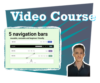
Video Courses
Uncertain?
Join a Video Course.
Each detailed project walkthrough provides repetitive practice for confidence building, as well as unique features to build your own library of reference material.
 Reusable code
 Step-by-step tutorial
 Solution code included
 Courses